My kitchen remodel has definitely been a “hurry up and wait” process. I did a structural remodel when I moved in almost two years ago, moving the cabinets around to create an island and open up the kitchen to the rest of the room. Here is what it looked like before:
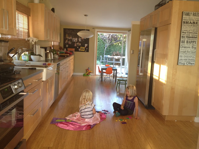
Rather than an island, the original kitchen had a wall with pantries and a refrigerator. The result is that I couldn’t see anyone in the living room while I was in the kitchen . . . so the kids ended up plopping on the floor of the kitchen when I was in there working. I wanted to create an island, and move the fridge to the other wall, to give this house a more open concept. I painted the cabinets white, and then used the same countertop surface I used in our previous house: white laminate over exposed plywood.
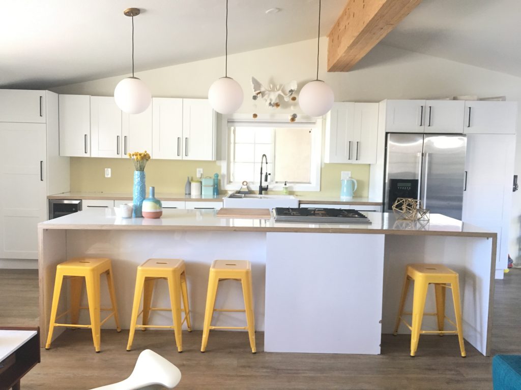
Then, slowly but surely over the past year I’ve been dressing it up and getting it to the place I wanted it to be. I installed some fun mid-century globe lights that I’m really loving.
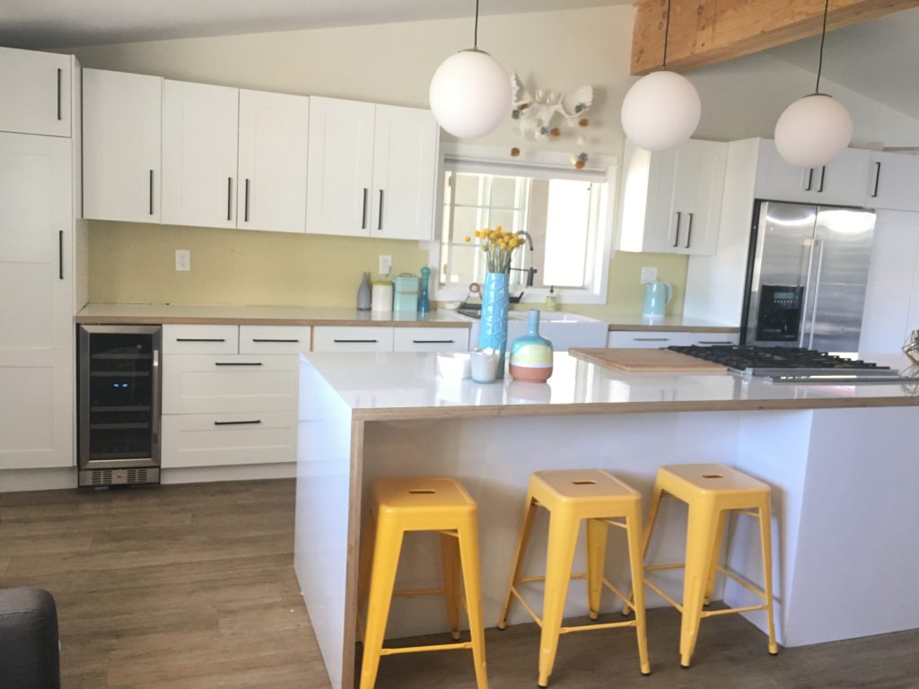
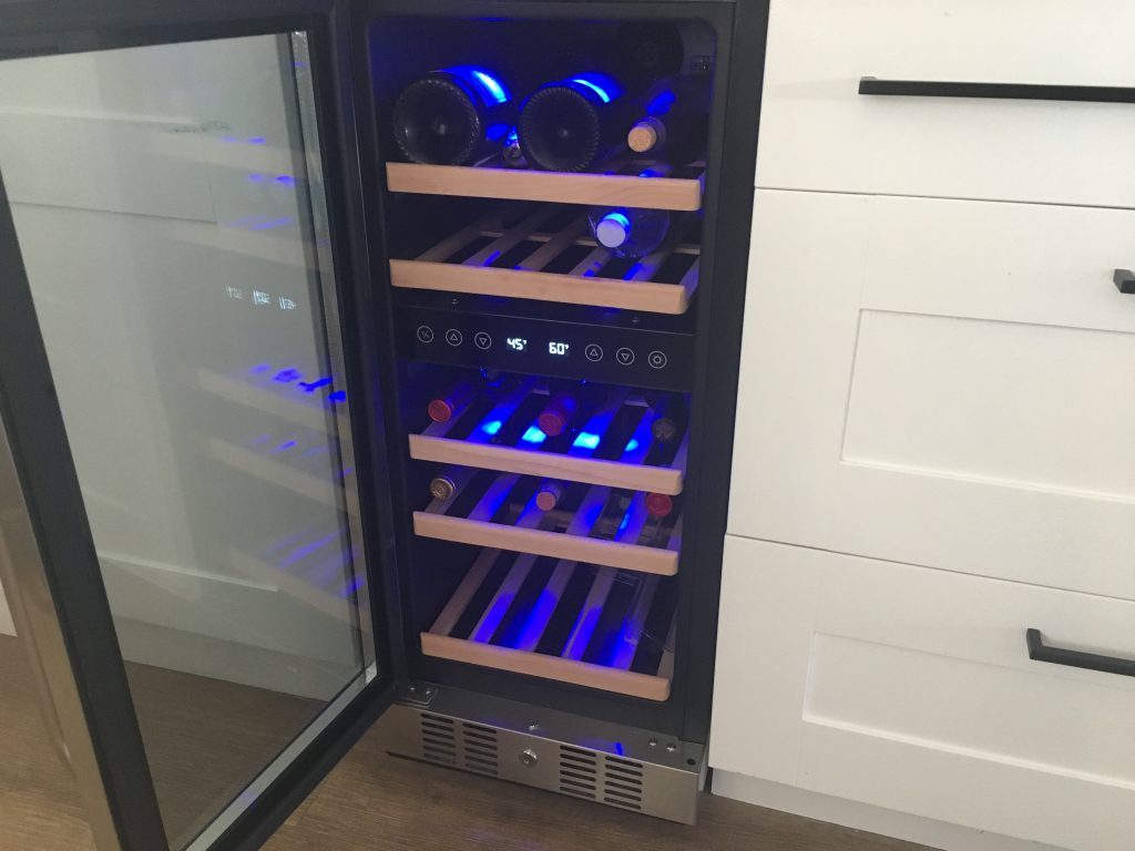
I also pulled out one of the cabinet banks and replaced it with a wine fridge from NewAir.
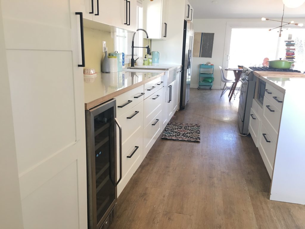
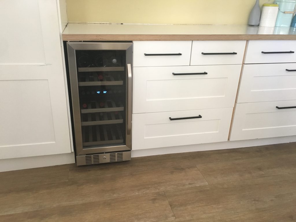
I’ve always wanted a wine fridge but it seemed like one of those unattainable luxuries – which is kind of silly because they are fairly reasonable. It stores 29 bottles and keeps the whites chilled and the reds at an optimum temperature. I am loving it so far.
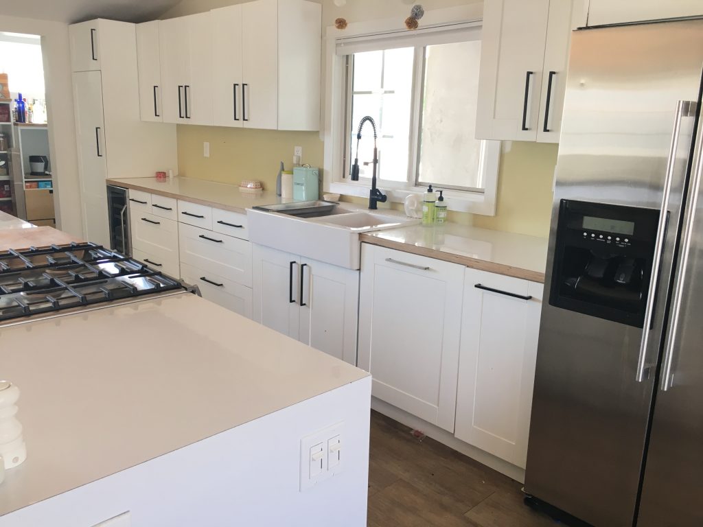
Another upgrade was a new matte-black faucet, and then painting all of the previously stainless cabinet pulls matte black. I had to take them all off and had them powder-coated but I feel like it makes the space much more modern.
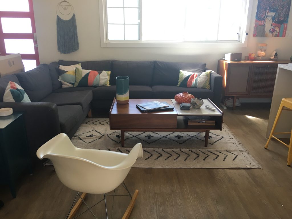
And last, I got a new rug for the seating area just next to the kitchen, to help divide them as separate spaces and also make the room a bit cozier. It’s a new print from Lorena Canals. I have one of their rugs in India’s room and became obsessed with the brand because all of their rugs are washable . . . when they get dirty you just pull them up and pop them in the washing machine. They started doing nursery rugs but now have some really fun full-sized modern patterns. I loved the subtle geometric design on this one.
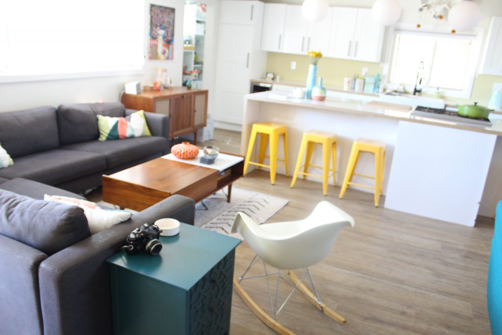

There is still a little work to do. I’m currently obsessing over what backsplash tile to use, and just ordered these modern white stools to replace the yellow ones. I also need to find a window shade with a pop of color . . . any ideas for me?
