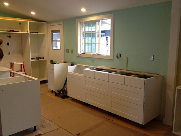
I’ve been putting off posting pictures of the house because, while we’ve been living here for a bit, there is still so much to do. But I thought I would share the before-and-after photos of our kitchen since it is technically done. I still need to “dress” the kitchen. We need window treatments and a backsplash and some accessories to tie it all together. But the bare bones are there, and I’m really please with the result. 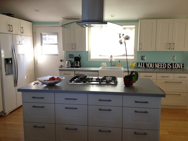 I posted last year about how much trouble I was having choosing the cabinet color. I went back and forth on this until the very last minute. In fact, I ended up finding about half of the modern brown cabinet fronts in the AS-IS room at IKEA, because they were being discontinued. I bought them, and ordered the remaining cabinets, determined that I’d do the dark brown since they were on sale. But once the kitchen walls came down and I saw how bright and airy the room felt, I couldn’t bear to darken it up with those cabinets. So I took them all back and got the white. Yes, they will show more dirt. But I think it was the right choice. I am a huge fan of IKEA cabinets. We put them in our last home and they performed really well, especially with four kids. I love how easy it is to design a kitchen with IKEA – I did the entire redesign by myself using their online planner and it was fun to see it come together just like it looked on the screen. Let’s take a stroll down memory lane. Here’s what the kitchen looked like mid-remodel, when we opened the wall to the living room and tore down the brick that comprised the “built-in BBQ” portion of the kitchen.
 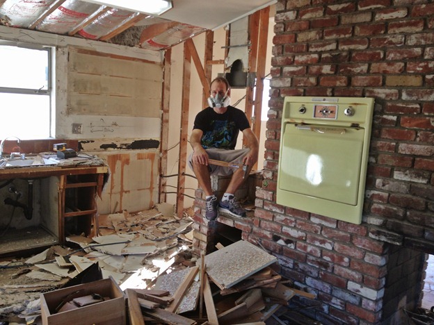 We also removed a wall leading to the dining area (which stood where that beam is in the middle of the room). Now the whole living space is an open room with a double-sided fireplace in the middle.
 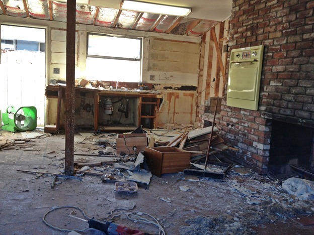 After the demo, we had to deal with the black mold, which you can see in the drywall in the sink. So gross. We hired a mold company to deal with the remediation because it’s serious business and we wanted it done right. It took forever and cost a lot of money and I’m glad that part is OVER.
 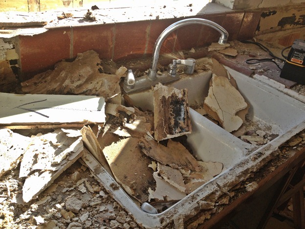 After the mold remediation, we put in new drywall, canned lights, a new window, and bamboo floors. FINALLY we were ready to install the cabinets.
  Here is a before-and-after shot facing away from the living room. We removed the wall that the fridge was on, so we had to move the fridge to the existing wall. We put the oven and microwave combo on that wall as well. We put an island where the fridge wall had been, and installed a cooktop there. The dishwasher and sink stayed in the same place.
 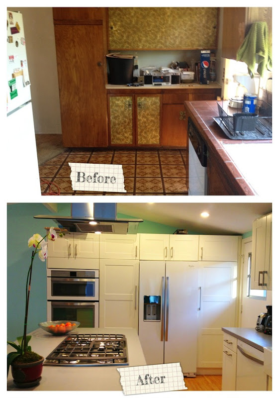 As you can see, we went with the Whirlpool White Ice collection for our appliances. Again, I think the white really brightens the room, and I love the counter-depth fridge and the incredible gas cooktop. The White Ice collection is really pretty in person. It’s hard to explain, but the surface is quite different from the usual pebbled white appliance. I suspect this line will become really popular. Here’s a photo facing the living room. We debated tearing down this wall because it eliminated a whole wall of cabinets in the kitchen, but I am SO GLAD we did it. I love being able to see straight through to the living room and back yard while I’m cooking, and we configured the island with storage on both sides. What we lost in overhead cabinets we made up for with drawers in the island. I prefer drawers, so it worked out well.
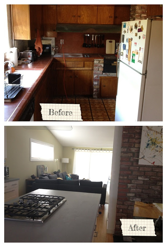 It’s hard to show an accurate before-and-after photo from the next angle because the wall kept me from backing up to get the shot, but this is the new view from the dining room:
 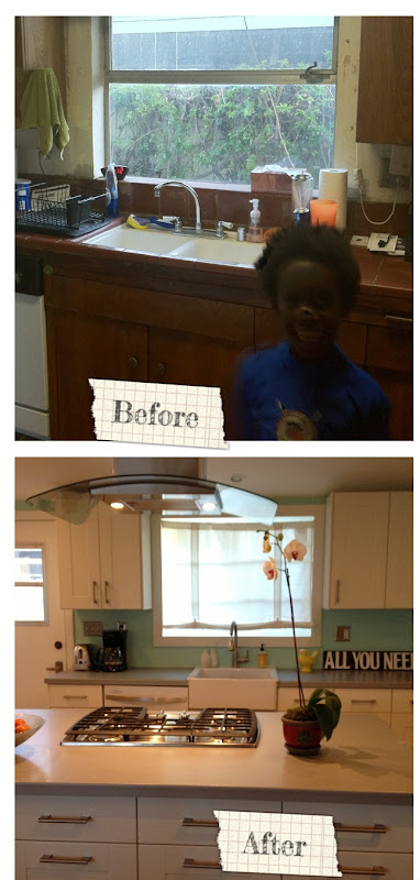 I also deliberated for a long time over whether to put drawers on the back of the island, or just leave it open with an overhanging countertop for seating. I opted for drawers. We needed the storage, and the dining table is sitting right there so putting in seating seemed redundant.
 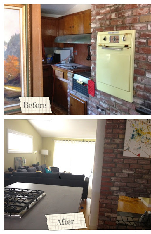 I do regret having to part ways with that vintage yellow stove, but it had to go for us to open up the wall to the living room. I do not regret parting ways with any other single aspect of this kitchen. It was bad. So bad. Funny story – when we first showed the kids this house, they walked around and Jafta told us he loved it and we shouldn’t change a thing. Later that night, though, I found India quietly crying. I asked her what was wrong, and she said, very diplomatically, that she felt bad because our new house was so ugly. She hadn’t wanted to admit it but she didn’t like how dark and dreary it was. I tried not to laugh at her design devastation and promised that we would change the way it looked. I also wish I could do a smell before-and-after for you, because that mold permeated the whole house. Yikes.
 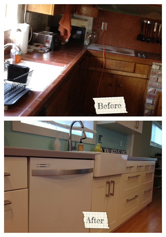 We had this same farmhouse sink in our previous house and knew we wanted it again, because it’s deep enough to hide a lot of dirty dishes. And don’t get me started on how happy I am to have a dishwasher after going without for three months. With the exception of the sink, all of the under-the-counter cabinets are drawers. Did I mention I love drawers? So nice to be able to see and reach everything.
 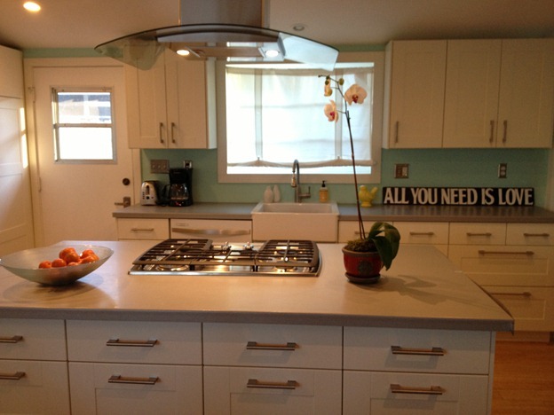 I was a little worried about having a range on the island but now that it’s installed I really like it. There is plenty of counter space on either side so I do most of my food prep at the island.
 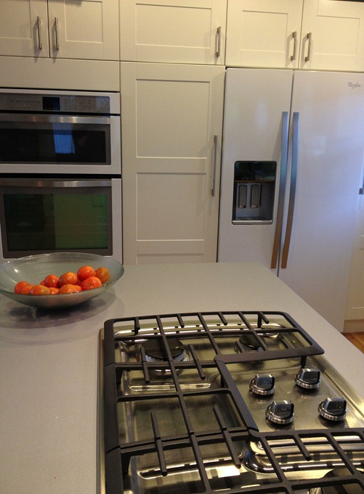 We went with Wilsonart for the countertops. We had this same counter surface in our previous house and wanted to use it again. It is affordable and indestructible, and the matte silver finish looks like stone.
 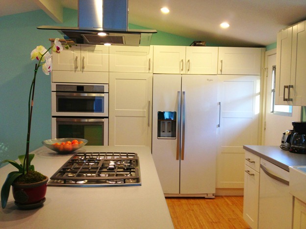 So there you have it – our new kitchen. She still needs a little dressin’ up, but we like her a lot! [Appliances provided by Whirlpool. Countertops provided by Wilsonart.]

Rage Against the Minivan sometimes earns revenue through sponsored posts, which are clearly labeled, and occasional affiliate links to recommended products. I only feature products that I truly like, and my opinions are always my own.